Sunday, April 24, 2016

Global Color Survey


I chose green for "good tasting" because the first thing that came to mind was deep green lettuce leaves (I've been eating a lot of salads lately). What's interesting to me is that the color red ended up being the one that most people chose. Even though they're different colors, it's still a color associated with vegetables or fruits which are healthy food choices. I also find it interesting that the color most people chose for sexiness is the same color most people chose for good tasting.


I choose the color purple three times: powerful, dependable and deity. I did this because when I consider purple to be the color of royalty, and I think of royalty as being powerful and dependable (at least they should be dependable). Deity is also something I think of as powerful so I think that's why the color purple came to mind. According to the results, purple yields nothing. Did anyone else select purple for any of the associations we were asked?


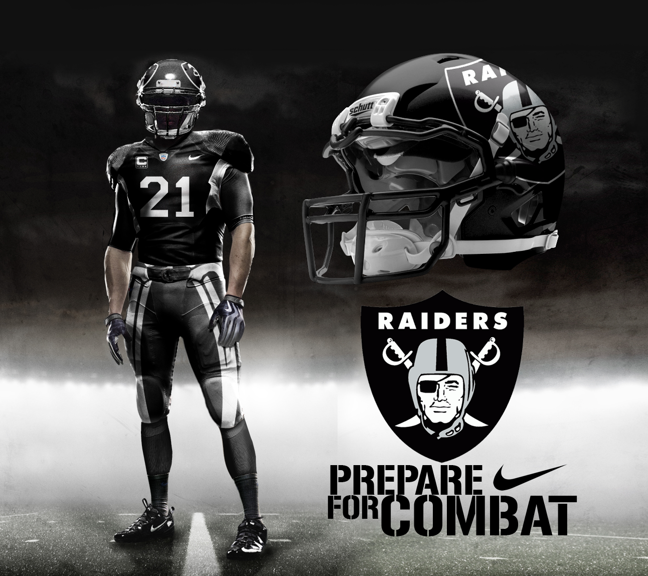
Something from Chapter 8 of WSINYE that really caught my attention was that "the concept of team colors is meant to inspire strong emotions." It goes on to say that the colors of the home team and visiting team are chosen depending on which emotions they are trying to convey. This immediately made me think of the Oakland Raiders. They have a representation for being the most frightening, dirty team in the NFL and they like it that way. Their team colors (black and silver) reflect that. Neither color is particularly warm or inviting, both are powerful, and together they're menacing.

Sunday, April 17, 2016

Appealing Alcohol


I'm very much a lightweight, so I don't foresee a lot of whiskey drinking in my future but this makes me want to, or at least be around people who do. The square design of the bottle and Jack Daniels embossed in the glass makes it look sophisticated to me. It's almost like I would want to be around people who drink this whiskey because they probably have a certain amount of class and financial stability to be able to even drink something as expensive looking as this. The soft light in the back creating the horizon line also makes me think that someone who drinks this isn't looking for a party. They are looking to unwind for a minute and enjoy.

I had to smile looking at the glass next to the bottle, knowing from Jim's presentation that the ice cubes aren't real, and cost hundreds of dollars. I also know that the warmth in the color of the liquid is because a gold card has been placed behind the bottle to make it look that way.

I knew that advertisements couldn't be trusted before, but now that I know more about how staged and planned everything we see is, I'm much more aware of how nuts it is. I can't look at anything steaming in commercials or ads without thinking of microwaved tampons. I've been telling everyone I know about it, and it makes them uncomfortable. My boyfriend told me he wished I hadn't said anything because now instead of food on TV ads, he sees tampons.

Sunday, April 10, 2016

Significant Women Brunch


It took me awhile to figure out something to do this video on. I first thought to do something that involved my cats, but I really don't need to reinforce the "crazy cat lady" label anymore than I already have. Instead, I decided to make a little advertisement for an event that the Campus Ministry Office here at Alverno is having.

Every year in April, the Campus Ministry Department puts on an event called The Significant Women Brunch. The Alverno community is invited to bring significant women in their lives to a brunch. Brunch, song and a keepsake are all included. This year, the theme is "Women Lighting the Way". I tried to pick a layout that could reflect this as much as possible, which is why I chose the one with the lights glowing in the background. I began the video with the question that is stamped on all of our flyers: Do you have a Significant Woman in your life? Everyone has at least one woman who has made an impact on them, whether it be a relative, friend, teacher or coworker. I then found stock photos of female relationships that are commonly brought to the Brunch. Many people bring their mothers or daughters. After these photos, I put in a picture of a really good looking brunch, followed by the basic information for the event. Because the audience is our class, I put at the end that if anyone wants more information, they can just ask me! I'm a student worker in Campus Ministry, so I should be able to answer any questions.

What was most annoying about this was that I couldn't get rid of the sample logos at the beginning and end of the video. Each time I clicked them to change them, it took me to a different screen and told me to upgrade to a business account if I wanted to edit. Did anyone else have this problem??

Sunday, April 3, 2016

Taking a Longer Look


Every time I have ever walked through the hallway that connects the second floor of the Rotunda to Founders Hall, I’ve done a backward glance to these gloves. I really like them because they baffle me. How could someone ever have had the patience to be able to create something so delicately beautiful? It wasn’t a surprise to me that this was the one I still wanted to come back and look at even more.

Looking closer at these gloves, I first noticed that what I once thought was a lace pattern is actually much more like vines. From what I learned about the Sacagawea Exhibit in our last class, I think the vines are meant to not only be something pretty to look at, but also a representation of growth that’s experience on a journey. The space that creates the vine pattern on the glove is completely cut through. It creates an interesting texture and value to the piece. The shadowed vines that show on the bottom layer of the glove gives the top layer more depth.

Something odd that I noticed was that one of the gloves has a rose attached at the bottom but the other doesn’t. I wonder if they are both supposed to be roses but the other maybe got lost somehow. If not, I’d be curious to know what it is supposed to be.